20 Oct 2010

A Complete Head - Shame there's no brain

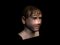
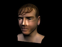
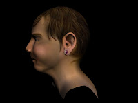
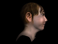
Having made the mesh, moulded it into 3d, given it materials and detailed information on light and texture, my head is now complete.


There are a couple of things wrong with it;

- The nose I think could be improved to look more like my own, however adjusting that at this stage would throw off the whole texture map and therefore I would have to do pretty much all the texturing again (at least every step).
- Hair could be added along with eyelashes using the Hair and Fur Modifier to give a more realistic look to the hair, make it spikey like the initial photographs that were used as guides. I did not choose to do this because through experience I have had extreme difficulty with this tool and with the time remaining before hand in I am not prepared to worry myself over this detail. The hair looks realistic enough.
- The ear piercing is not 3 dimensional; the piercing should protrude from the ear, and if you're picky the butterfly should be created behind the ear. But this detail is not needed.
- The back the the entity does not look quite right in terms of colour matching, however due to the target areas being on opposite sides of the photoshop file I fail to see how these could be matched up easily.
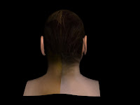


Overall though I am very pleased with my head, it has turned out well and on the whole, does look like me! (At least me when I don't spike up my hair!!!

Specular Map

I have created a specular map for the mesh to make a more realistic light distribution.


The first time I imported this into MAX there was a problem; the fringe had some extra light, perhaps where I had not gotten rid of the embossing effect or the more likely I think, that when changing the Levels in the adjustments menu, the level of white is too high in this area. So putting this into MAX, this is what happened:


There is a horrible shine around the fringe, ghastly white areas that looks awful. Also, all over the skin there is a "freckly" effect where the levels weren't dark enough. However when trying to modify this, levels for other areas of the image were unusable.

My first attempt to fix things only made this worse. Trying to adjust the levels or paint over the area just resulted in the following (below, left).


To fix the problem I had I simply turned off the layer creating the problems and created a solid black layer to sit behind the drawn in highlighted areas (above, right).

Then to recreate the irregularity of the skin and it's composition I distorted the layer with a the texturizer modifier (sandstone) to give it more detail.


And there you go, hey presto, you have a bumpy, light-controlled, realistic looking head! The way the skin reacts to the light is relative to the oiliness of the skin and now looks realistic in that sense.


And that completes my head!

19 Oct 2010

Texture Mapping; Bump Map

I have now created a bump map to give the skin on my head more depth and make it look more realistic. There were quite a few areas of the perimeter that were embossed and needed to be mixed in.


The first render was too fine, and I did need to add the MIX with NOISE to make the skin more realistic and irregular in terms of pattern.


All that I can say is I played with the settings, adjusting values, sliders and mix values until I was happy with the result. I decided on this (below).

Texture Mapping Continued; Normals

Firstly, here is my complete texture map, (notice I have gone to the detail of removing the ear piercing from the side I don't have!).


Using a normals render without visible edges the depth of features on the face could be determined.


Please notice the left side of the upper lip. I noticed that my map did not match up with my mesh in some areas, (especially the lips e.g. not tall enough). I followed the tutorial and marked up the texture map file, but found that editing the texture map at this point to be unsuccessful and looking unrealistic! The colours were not right and too constant throughout the whole lip. Having noticed this after mixing the layers and patching, the only option after seeing that copying in patches again was ineffective was to "draw" it in using the clone tool. The problem was, I think, that the source for the clone is too small to give a useful sample.

This was ineffective and so I decided to leave this factor and move on through the tutorials.

18 Oct 2010

Completing the Texture Map

Here are the final stages of the completion of the texture map in terms of initial map creation.


Filling up the last few areas was a pain, the ears especially were hard. Where my hair was overlapping my ears in the source photographs, this has been carried forward to the material map and as you can see by the right image above it does not look very realistic. Therefore this was removed and using initiative other skin coloured areas were used to "recreate" the ear.


Using Hue / Saturation it was fairly easy to match colours up; simply sliding the values for both allowed for visual comparison between the layer in question and the surrounding layers. (This was done before the merging of layers, and for each layer the modification was merged down with that layer so it did not affect any others (found this out the hard way!).


The nostrils were easier than I had first thought with the simple filling up the hole with a skin tone colour using the clone tool. Using the patch tool got rid of all the lines and colour differences between the different portions of skin. THIS TOOL IS ABSOLUTELY AMAZING. I actually love this tool, it was so helpful and once I figured out how to use it effectively, it was unreal how quick and useful it could be.